
How to choose the right brand font
Your guide to brand typography
Typography is the humble underdog of branding: impactful and essential—yet often relegated to the sidelines of visual identity curation.


While other aspects of design (like selecting the right colour palette and logo) are surely fundamental, so too is the art of carefully selecting brand fonts that strategically convey your brand’s unique story. The goal is to select a style that aligns with your brand’s broader identity—including its values, vision and target audience. But before we dive into the nitty-gritty of choosing the right fonts for your brand, we must first define the overlapping—and often confused—terminology that distinguishes typography from typeface, and typeface from font:
Typography
Typography is the art and science of arranging written language to enhance readability, aesthetic appeal, and brand communication. More than just selecting a font, typography encompasses the way letters, words, and paragraphs are structured to create a cohesive visual language. Elements such as kerning (space between individual letters), leading (vertical spacing between lines), and tracking (overall spacing across a word or sentence) play a fundamental role in ensuring clarity and legibility.
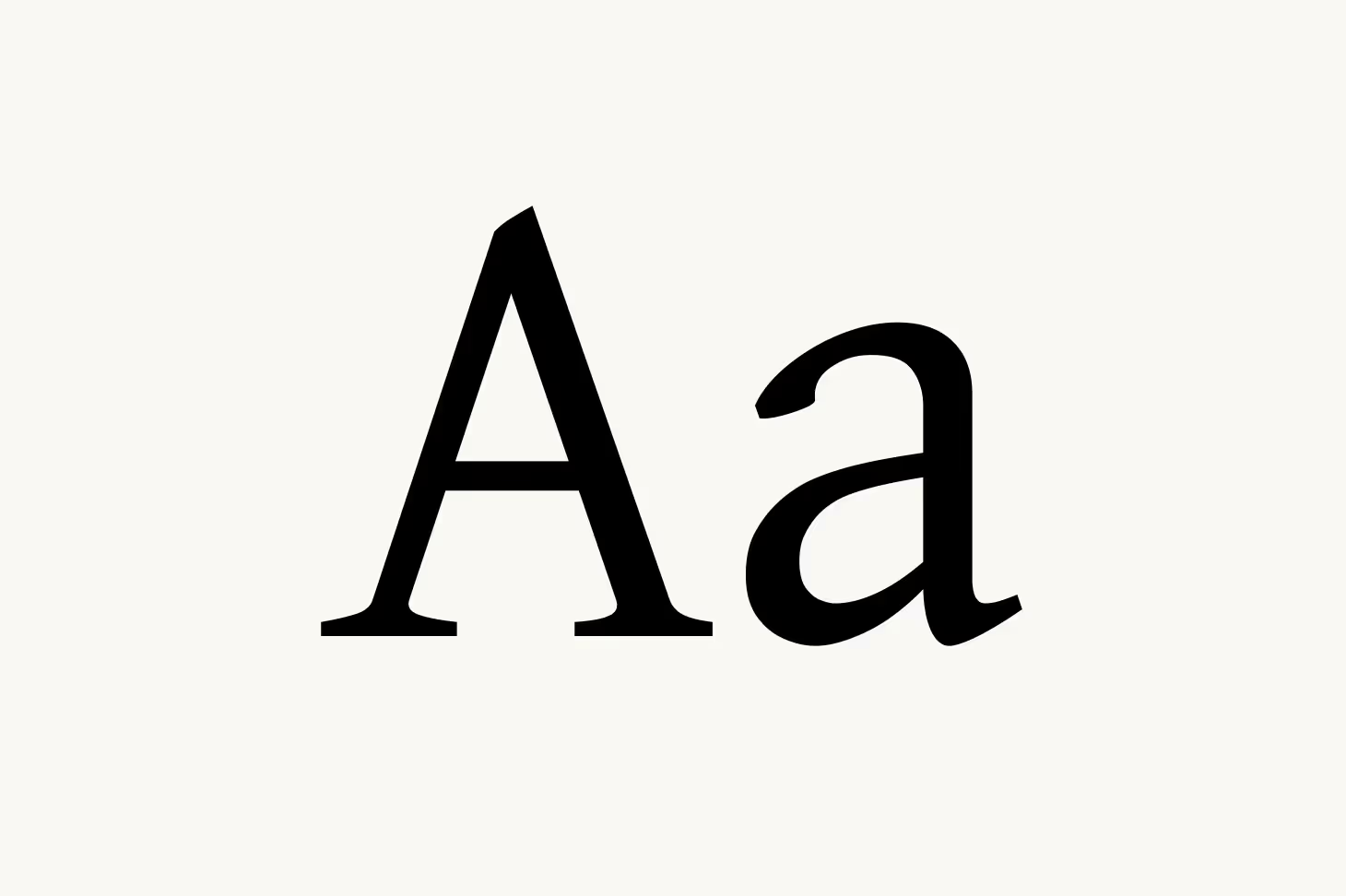
Typeface
A typeface, also known as a font family, is a collection of characters—including letters, numbers, punctuation marks, and symbols—that share a unified design. Each typeface conveys a unique personality, often influenced by its historical origins, structure, and stylistic details. For instance, a fashion typeface such as Didot exudes high-end sophistication with its refined contrast, while a beauty typeface like Bodoni brings an editorial, timeless quality to luxury branding.
Typefaces are classified into different categories, including serif, sans-serif, slab serif, script, monospace, and display, each carrying distinct characteristics that shape their application in branding. A typeface is not a single fixed style but a broader system that houses multiple fonts—variations in weight (light, bold), width (condensed, extended), and slant (italic, oblique).
Font
A font is a specific variation within a typeface family. While a typeface defines the overall aesthetic, a font determines its particular style, weight, and size. For example, within the Futura typeface, Futura Light, Futura Medium, and Futura Bold are distinct fonts that provide different tonal expressions. Similarly, Baskerville Regular, Baskerville Italic, and Baskerville Semibold belong to the Baskerville typeface, allowing for typographic variation while maintaining a consistent brand identity.


Typography and branding
Brand typography ensures visual consistency, while strategic typeface and font variations help define hierarchy, emphasis, and mood. Ultimately, the goal is to curate visual elements that thoughtfully reinforce a cohesive and distinct visual identity. Just as a logo, colour palette, and photography style can evoke a singular aesthetic, typographic elements must be consistent and well balanced—reflecting a singular and coherent typographic language that is instantly recognisable.
Beyond its aesthetic attributes, typography plays a practical role in enhancing legibility and functionality. The art of typography—including the curating of font styles, defining of spacing, and refining of character size down to the last millimetre—can significantly impact the way a brand is perceived. For example, careless typographic choices, such as using a decorative font in a digital interface or misplacing inconsistent weights across branding materials, risk tarnishing brand credibility and disrupting the brand experience.
To ensure consistency, brands should establish clear typographic guidelines. Such guidelines should be documented in a ‘brand style guide,’ which is an in-depth internal document detailing every aspect of a brand’s identity—from design to tone of voice. Insofar as typography is concerned, a brand style guide should detail the primary and secondary brand typefaces, font hierarchies, spacing rules, stylistic variations and more.
The typographic hierarchy
The purpose of a typographic hierarchy is to improve the readability of text by arranging it according to informational importance. For example, an editorial feature that includes a headline, subheadline, and body text is created using a three-tiered hierarchy, whereby the headline acts as the primary text, the subheadline as the secondary text, and the body as the tertiary text.
Beyond size and placement, hierarchy can also be established through emphasis—such as bold, italics, colour, and case—to highlight key words or phrases. Spacing and alignment, including line height, letter spacing, margins, and text alignment, further influence readability and visual structure. Additionally, contrast and weight help differentiate text elements by adjusting font size, thickness, and colour, ensuring a clear and logical flow for the reader. Typographic hierarchies are important for all forms of a brand’s written communication—from typography in logo design to social media assets, PR communications and beyond.
Font pairing
When defining a brand’s typography, a seasoned designer will typically select two or more fonts that contrast in style yet complement each other in tone. By carefully pairing contrasting fonts, the designer avoids visual monotony and ensures a clear, clean typographic hierarchy is upheld.
A common—and near universal—approach is to balance the classic tone of serif with the contemporality of sans-serif. Aesop provides a good example of this balance at work by combining the GT Sectra, a sharp, editorial serif, with the simple, structured sans-serif Suisse Int’l. The result is a high-contrast pairing that feels both intellectual and refined yet clean and contemporary. Similarly, Byredo balances the warm, characterful serif Plantin with the simplicity of the sans-serif Helvetica—exemplifying its narrative as a contemporary label rooted in minimalism and inspired by the rich heritage of fragrance artistry.

The major typeface classifications
While it is nearly impossible to compile a complete list of all typefaces—as there are thousands in existence, with new ones being created regularly—the list below offers a comprehensive classification of typefaces, including historical and contemporary examples across major categories:
Serif
The serif typeface has a rich legacy dating back to Roman inscriptions, where their delicate yet structured letterforms were chiseled into stone and inscribed onto artefacts with fine brush strokes. With the advent of the printing press in the 15th century, serif evolved into distinct subcategories—Old Style, Transitional, and Modern serif—each exuding refinement and heritage.
Their historic weight and timeless elegance make them a natural choice for luxury brands seeking to convey sophistication, trust, and exclusivity. Vogue, Cartier, and Tiffany & Co. all leverage beauty typeface and fashion typeface styles, subtly adapting serif typography to maintain a contemporary edge while preserving an air of prestige. The association of serifs with traditional print media, literature, and high-end branding reinforces their authority, making them a preferred choice for heritage-driven identities.

Sans-serif
In contrast, sans-serif fonts emerged in the 19th century and gained prominence in the 20th century, particularly during the rise of Modernist design. Their clean, unembellished forms symbolise clarity, simplicity, and innovation—aligning seamlessly with contemporary branding trends that favour minimalism and digital adaptability.
Sans-serif fonts are widely used in tech, fashion, and lifestyle industries, where a streamlined, approachable, and versatile aesthetic is essential. Brands such as Apple, Saint Laurent, and Burberry have embraced sans-serif typography to reflect modern luxury, understated elegance, and forward-thinking design.


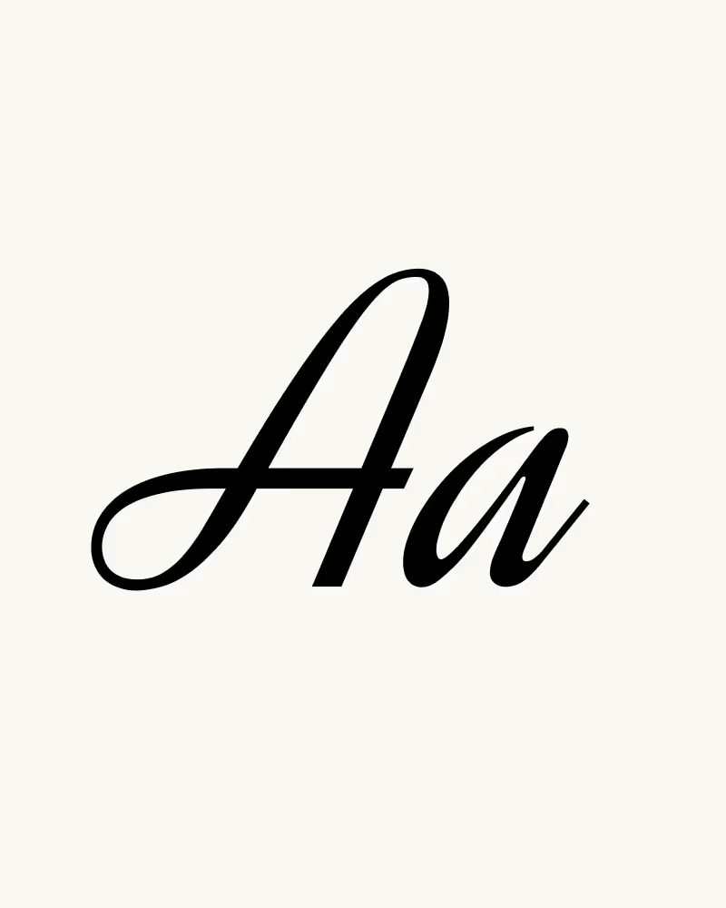
Script
Rooted in the artistry of calligraphy, script typefaces bring an element of fluidity and human touch to typography. From delicate copperplate styles to expressive hand-drawn lettering, scripts capture a sense of elegance, personality, and craftsmanship, making them a timeless choice for brands seeking to evoke intimacy and sophistication.
Luxury, beauty, and hospitality brands frequently turn to script typography to enhance their visual storytelling. Estée Lauder, Cartier, and Ritz-Carlton seamlessly incorporate script fonts to create a refined yet inviting identity, reinforcing notions of exclusivity and bespoke craftsmanship. Whether formal or casual, script typefaces lend an air of authenticity and warmth, making them indispensable for brands that thrive on emotional connection.

Monospace
Rooted in the artistry of calligraphy, script typefaces bring an element of fluidity and human touch to typography. From delicate copperplate styles to expressive hand-drawn lettering, scripts capture a sense of elegance, personality, and craftsmanship, making them a timeless choice for brands seeking to evoke intimacy and sophistication.
Monospace typography is widely associated with futuristic minimalism and utilitarian design, making it a preferred choice for industries spanning cybersecurity, fintech, and contemporary fashion. Brands such as IBM, Balenciaga, and Off-White leverage monospace typefaces to communicate an avant-garde, experimental edge, reflecting a shift toward digital-first branding that blends nostalgia with modernity.


Display
Unconventional and expressive, display typefaces are designed to captivate, making a statement through exaggerated proportions, decorative details, or striking forms. Whether rooted in vintage ornamentation or cutting-edge experimental typography, display fonts demand attention and convey personality, making them ideal for brands that seek distinction.
From high-fashion campaigns to disruptive streetwear labels, display typefaces have carved out a space in industries that thrive on visual impact. Brands like Dior, Supreme, and Balmain utilise bold display typography to assert their presence, creating instantly recognisable logotypes and editorial layouts. Their dramatic and often artistic nature ensures they remain a cornerstone of identity-driven branding, where uniqueness and visual storytelling are paramount.


Open-source, paid and custom fonts
Many brands begin their journey with open-source or licensed fonts, drawn to their accessibility and professional design. However, as a brand grows and refines its presence, typography must evolve alongside it. A truly distinctive brand demands a typeface that is not only visually aligned with its essence but also exclusive to its identity. Custom typography offers a level of refinement, ownership, and storytelling that pre-existing fonts simply cannot match. Let’s dive deeper:


Open-source fonts
Premium type foundries such as Monotype, Hoefler & Co., and Klim Type Foundry offer a vast collection of meticulously designed typefaces that provide greater refinement, versatility, and exclusivity than their open-source counterparts. Brands investing in licensed typefaces gain access to beautifully crafted letterforms with multiple weights, styles, and fine-tuned kerning—ensuring a sophisticated and polished visual identity. While paid fonts elevate a brand’s presentation, they remain accessible to any business willing to purchase a license. As a result, even high-quality typefaces can become ubiquitous, limiting their potential to create a truly ownable brand experience.


Paid fonts
Open-source fonts, such as Google’s Roboto or IBM’s Plex, have democratised typography, offering a diverse selection of professionally designed typefaces that are freely available for use. Their accessibility makes them a popular choice for startups and digital-first brands seeking functional, well-crafted typography without the cost of licensing. However, because they are widely used, open-source fonts rarely provide the distinctiveness required to establish a premium or highly recognisable brand presence. In industries such as fashion, beauty, and lifestyle—where brand identity is paramount—relying on publicly available fonts can result in a visual identity that feels generic or indistinguishable from competitors.


Custom fonts
A true signature of distinction, custom fonts are the ideal solution for brands seeking to establish an unmistakable presence. A custom typeface is the ultimate expression of identity—a visual signature as unique as a logo or colour palette. A bespoke typeface is crafted exclusively for a brand, tailored to reflect its personality, values, and market positioning. It ensures absolute distinctiveness, creating a cohesive typographic language across all brand communications, from product packaging to digital experiences.
Global icons across fashion, beauty, travel, and lifestyle have long recognised the power of custom typography: Burberry introduced a bespoke serif typeface, Burberry Didot, as part of its brand refresh, blending heritage with modernity; Chanel uses Chanel Couture, a refined sans-serif typeface, reinforcing its timeless elegance; Airbnb developed Cereal, a geometric sans-serif designed for seamless digital and print consistency; Vogue utilises a proprietary version of Didot, synonymous with high fashion and editorial luxury; and MAC Cosmetics employs a sleek, high-contrast custom sans-serif to amplify its bold and edgy aesthetic. In each case, typography is not an afterthought but a cornerstone of brand identity—carefully designed to evoke the right emotions, build recognition, and stand the test of time.


Create a bespoke brand identity
For brands seeking differentiation and distinction, a strategic investment in a brand identity is a statement of intent—a commitment to quality, uniqueness, and long-term brand equity. At DUTCH DESIGN AGENCY, our expertise lies in the strategic curation of bespoke brand identities. Whether refining an existing identity or creating a new brand, our expertise in branding, design and typography will ensure that every asset—from letterform to logo—tells a cohesive and captivating narrative. Ready to start? Let’s create an identity that sets you apart.