
How to build a brand colour palette
Everything you need to know about colour & branding
You don’t have to be a colour connoisseur to recognise the gargantuan role colour plays in branding. In fact, choosing the right colour can increase brand recognition by up to 80%.
So, why does colour matter so much, and what does it take to get it right? In this guide, we’ll show you how to turn colour into one of your most valuable brand assets.
source: [A target='_blank' link='https://www.rolex.com/rolex-and-sports/motor-sport']Rolex[/A]
Why brand colours matter
From Hermès orange to Tiffany blue, brands adopt and trademark colours that become iconic symbols in their own right. But beyond being stylistic signatures, colour plays a strategic role in building strong [A target='_blank' link='https://dd.agency/branding/identity']brand identities[/A]. That’s why curating a brand colour palette is about far more than simply choosing what looks good. It’s about evoking a mood, inspiring an emotion and conveying a message. Your brand colour(s) should work in tandem with other [A target='_blank' link='https://dd.agency/branding/assets']brand assets[/A] to form a cohesive [A target='_blank' link='https://dd.agency/insights/engaging-visual-identity']visual identity[/A].
Contents
STEP 1: Understand the psychology of colour
Colour psychology is the silent strategist behind every successful palette – because colour isn’t universal, it’s contextual. The same hue can soothe or provoke, depending on how, when and where it’s used.
And in a world obsessed with motion, video, and viral storytelling, colour remains the most immediate way to trigger emotional recognition. We process colour faster than words or shapes. We feel it before we understand it – which is why the most successful brands use colour like a language.
For emerging or reimagining brands, choosing the right brand colour palette means balancing aesthetics with intention. You’re not just picking a hue, you’re creating a shorthand for your values, your voice, and your vision. Understanding the psychology of colour can help you create a memorable, high-impact brand.
Red
Red stirs a spectrum of intense emotion. It’s the colour of seduction and danger, love and alarm – a bold duality that’s both captivating and complex. It energises, empowers and excites, but can just as easily overwhelm.
Used in branding, red never blends in – it asserts, commands and demands attention. The key is intention: does the emotional charge of red align with your brand’s identity?
From deep crimson to vivid scarlet, red can signal luxury, rebellion, confidence or desire. For fashion, beauty and lifestyle brands, it’s a high-impact choice – best used when the emotion it evokes serves the story you’re telling.

source: [A target='_blank' link='https://www.ferrari.com/en-EN/auto/f80']Ferrari[/A]
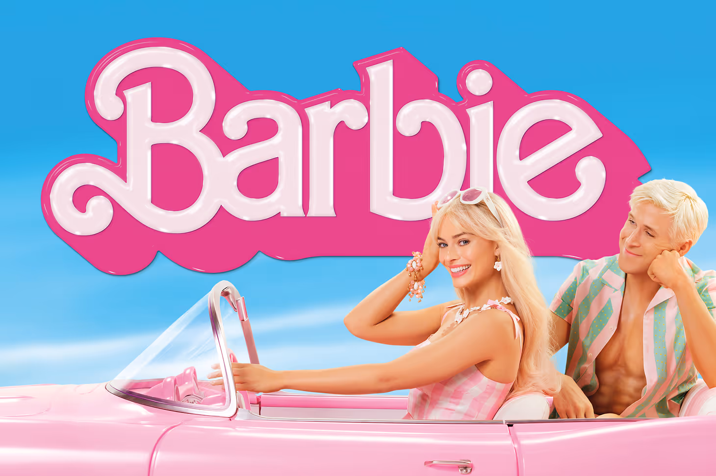
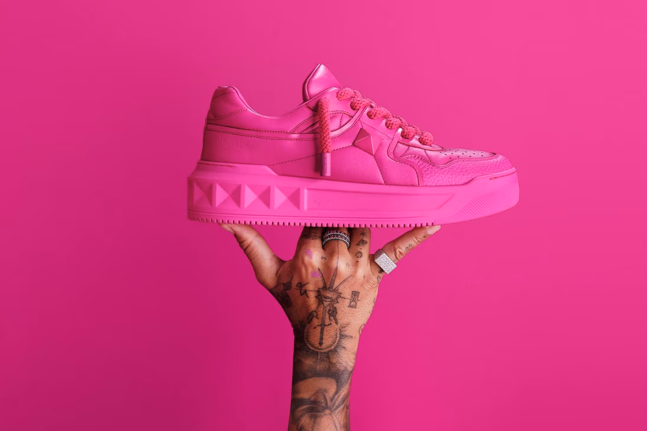
Pink
Pink is a paradox – tender yet assertive, playful yet purposeful. Its emotional range is vast, shaped entirely by tone and context. Soft pastels whisper nostalgia, romance and calm; bright fuchsias feel unapologetic and bold; deeper tones like rose or mauve bring depth, elegance and a sense of timelessness.
In branding, pink offers nuance. It can disarm or delight, soothe or energise. It’s often associated with femininity – but today, that femininity is multifaceted. Depending on how it's used, pink can feel rebellious, ironic, nurturing or luxurious.
For brands across fashion, beauty and lifestyle, pink invites emotional connection – but it should be used with clarity and care. Ask what emotion you want to stir. Then choose a tone that supports your story, and a palette that lets it sing.
source: [A target='_blank' link='https://www.aboutamazon.com/news/entertainment/barbie-movie-streaming-prime-video']Amazon[/A]
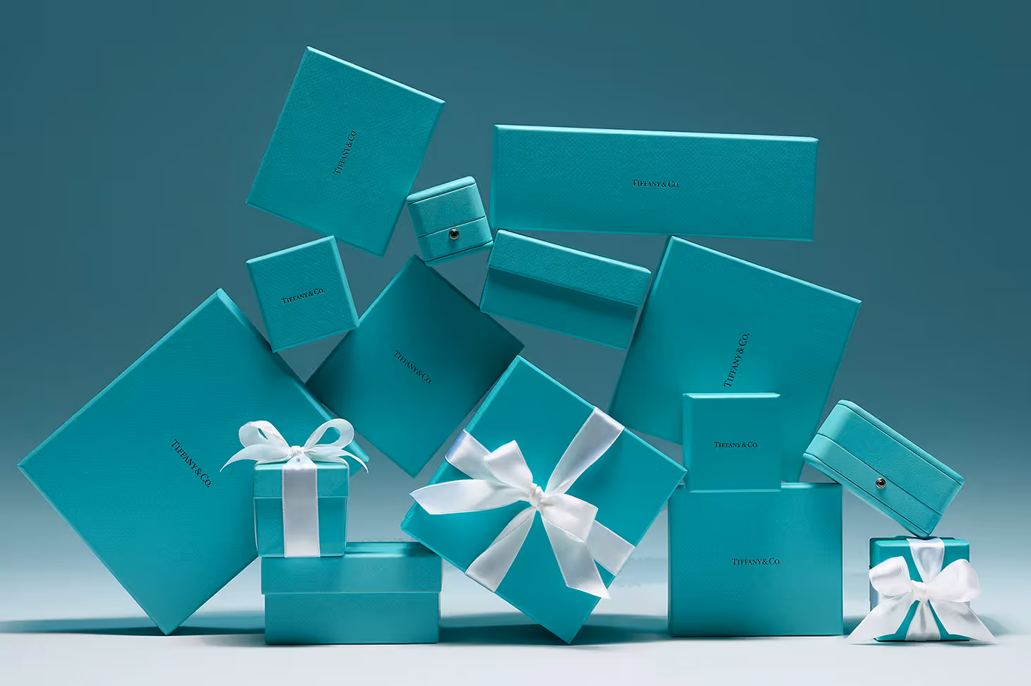
Blue
Blue is a colour of instinctive trust. Rooted in associations with clarity, calm and credibility, it carries a quiet authority that has long made it the go‑to for brands seeking to signal intelligence and reliability. In sectors where assurance matters, blue’s steady presence offers stability. It conveys control without arrogance, order without coldness. But beyond corporate convention, blue is evolving.
Today, soft, desaturated tones suggest wellness and serenity, aligning with a more holistic, human‑centred approach to branding. Pale blues soothe; powdery hues hint at nostalgia; muted mid-tones speak to modernity with a gentle edge.
But blue does have a downside: as one of the most commonly used colours in branding, it can easily fade into the background. That’s why nuance matters. The right tone paired with a considered supporting palette can transform blue from generic to distinctive.
source: [A target='_blank' link='https://www.instagram.com/p/DKMvCrCRvE5/']Tiffany & Co[/A]
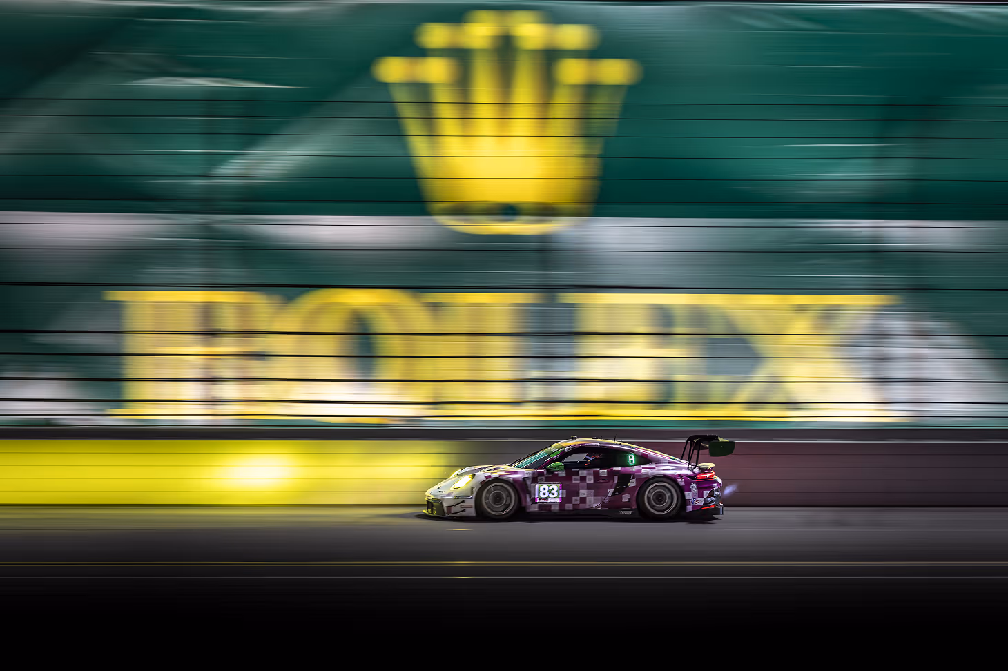
Green
Green has always been nature’s neutral – evoking feelings of growth, renewal and vitality. In branding, it carries strong associations with sustainability, health and ethical living. But green is far from one-dimensional. Its tonality can shift meaning dramatically. Soft sage or eucalyptus hues whisper calm and balance, often used in wellness, skincare, and interior brands to suggest serenity and simplicity. In contrast, deep forest greens can evoke heritage and prestige, lending gravitas to everything from fashion to finance.
As green becomes a visual cue for environmental values, brands must apply it with care. Audiences are increasingly sceptical of surface-level sustainability. A green palette should align with purpose – not just aesthetics. When thoughtfully chosen and consistently applied, it can signal trust, transparency and intent.

source: [A target='_blank' link='https://www.rolex.com/rolex-and-sports/tennis']Rolex[/A]
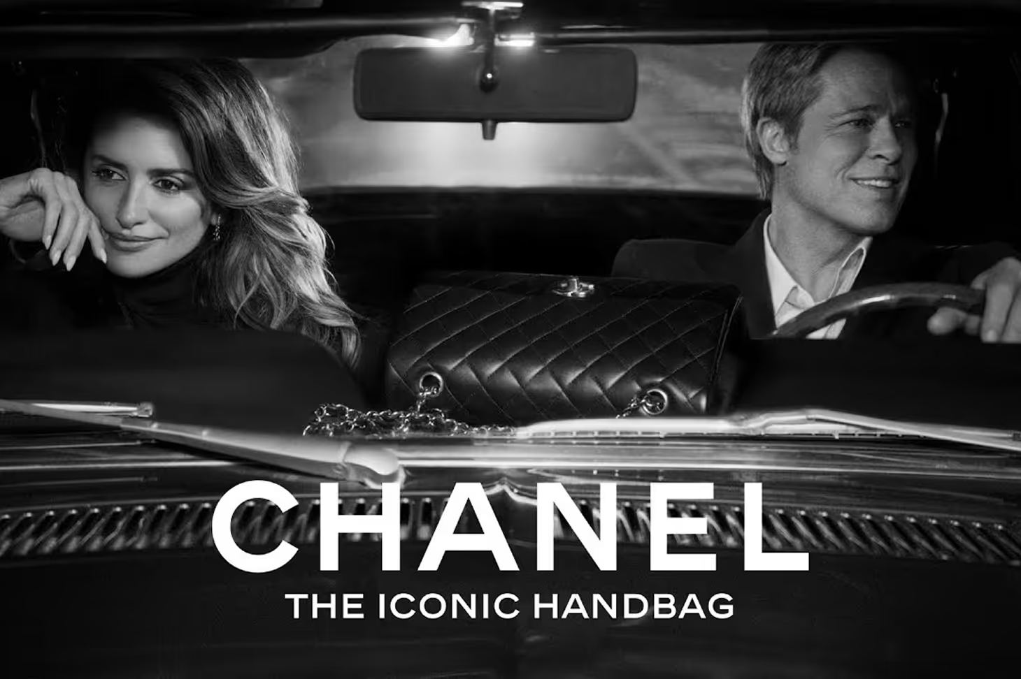
Black
Black is the great equaliser – or the great amplifier, depending on how it’s used. In branding, it signals sophistication, control, minimalism and power. It strips away noise, sharpens focus, and often reflects a brand confident enough not to shout. Paired with white, it conveys timeless elegance; contrasted with bold hues, it adds drama and edge.
Luxury brands have long understood black’s symbolic weight – using it to communicate refinement, restraint and quiet authority. It’s a staple of high-end logos: simple black lettering, often in a serif font, set against a white backdrop for maximum impact.
For brands, black is a tool of intention. It can elevate, refine or simplify – but its power lies in how and where it’s used. Whether anchoring a palette or creating contrast, black brings clarity, structure and undeniable presence.
source: [A target='_blank' link='https://www.youtube.com/redirect?event=video_description&redir_token=QUFFLUhqbHlDbkFvQjFETjItZFoxTHk2cDNDdFVCdC1sUXxBQ3Jtc0ttci1EY21VVTlLZUhTdGNsNkVXLTBnYWtVWXAyOUpvREpaSndhT1BxOXhHTGVxMVYzN2ZCU29HSGlOR081aDd2Mng2c0gtUmo1Unhzc2t4WUVLSG0yUkloSWZxbnpsS015ZE5aLXBObV9QTEhGd0xpcw&q=https%3A%2F%2Fwww.chanel.com%2F-YT-RTW_FW24-25&v=MM7GHU-pJXM']Youtube[/A]
White
White is the unsung hero of brand palettes. Not because it demands attention, but because it makes space for it. Associated with clarity, spaciousness and modernity, white conveys a sense of possibility.
Its strength lies in versatility. White creates breathing room, enhances contrast, and elevates other colours without competing. In digital contexts, it improves readability and neutrality. In luxury and wellness, it suggests simplicity, precision and high design.
Think of white as visual silence – the negative space that lets your hero shades sing. Use it generously across interfaces, packaging and print to create clarity and hierarchy. Paired with deep tones, it adds drama; with pastels or neutrals, it softens and soothes – making it ideal for brands seeking calm, refined expression.
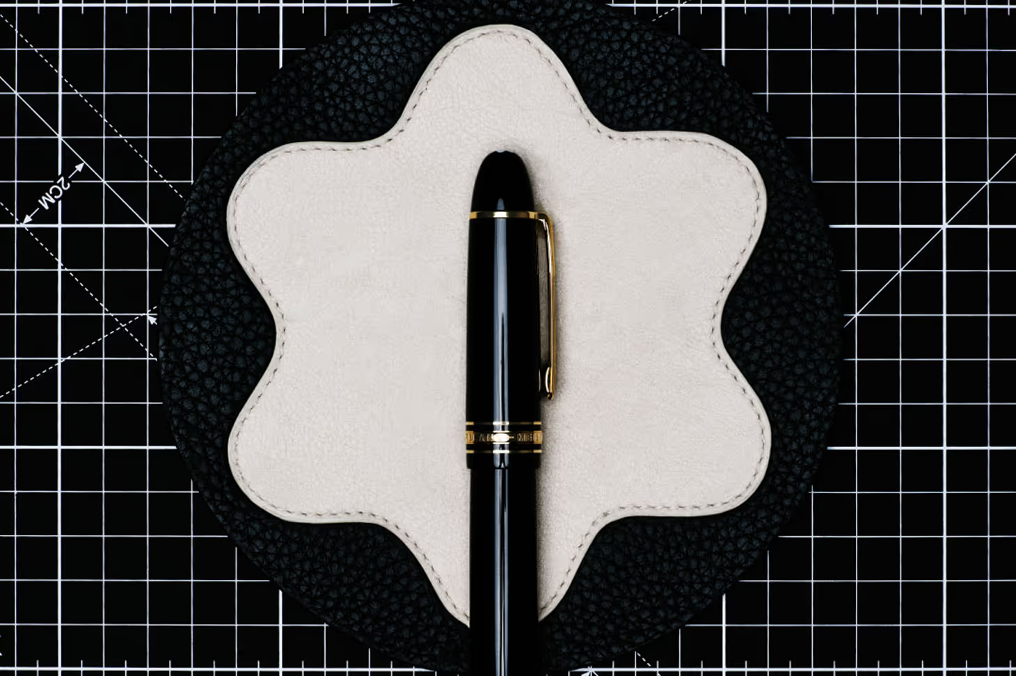
source: [A target='_blank' link='https://www.montblanc.com/en-nl?utm_source=google&utm_source_platform=SA360&utm_medium=cpc&utm_campaign=A-MTBHQ-NL-EN-BR_BRAND_PURE_EXACT-PROL-FY25-MTP-MULTIPLE_COLLECTIONS-SN-AUC-PU-LXA-GG-BR-RIC9PAC4RLH&utm_id=9728689111&&mid=2300mp249308&mkwid=s_dc&pcrid=693602003677&kword=montblanc&match=e&plid=&gad_source=1&gad_campaignid=9728689111&gbraid=0AAAAADmBEK6IorKJfSMQ9Aa9IIoINrgpG&gclid=CjwKCAjwg7PDBhBxEiwAf1CVu1rS72mjYv-CjiYzhLHf9GsFUw0Kju6WJiu-icKmz96YcR92fTB3TBoCUHEQAvD_BwE&gclsrc=aw.ds']Montblanc[/A]
Orange
Orange sits at the intersection of energy and approachability. It’s a colour that suggests warmth, optimism and a certain entrepreneurial spirit. Brands that use orange often want to be seen as creative, confident, and unpretentious (think of Fanta’s vibrancy or EasyJet’s disruptive visibility).
Unlike red, which can sometimes feel aggressive, orange feels friendly and forward-moving. It’s ideal for brands seeking to combine energy with accessibility, from tech startups and food brands to logistics and e-commerce. But it requires balance – too much can feel juvenile, too little can be forgettable. Used strategically, orange radiates charisma without the ego.
To use orange effectively, treat it as a highlight rather than a foundation. It makes an excellent accent for call-to-actions, navigation elements, or packaging details. Pair it with charcoal, navy or neutrals to anchor its vibrancy. For more daring identities, a desaturated terracotta or burnt orange can introduce sophistication without losing warmth.

source: [A target='_blank' link='https://www.instagram.com/p/CslDsSBMk7f/']Hermes[/A]
Yellow
Yellow is sunlight distilled. It’s a symbol of optimism, clarity and cheer. And in branding, it’s a high-risk, high-reward colour. Too much, and it can become overwhelming; just enough, and it lights up a brand’s identity. Yellow is often used to signal creativity and happiness, making it a common choice for children’s brands, creative tools, and service industries that aim to uplift. IKEA uses yellow to signal energy and affordability, while Veuve Clicquot’s yellow label suggests brightness with a premium edge. For emerging brands, yellow can act as a bold differentiator – just be mindful of its legibility and saturation across different media.
When building your palette, use yellow with intention. As a primary or secondary colour, it pairs best with cool-toned contrasts like navy or slate grey. In digital settings, ensure your yellow has enough contrast to maintain accessibility, especially on light backgrounds. Muted variations such as ochre or mustard can retain warmth while softening the visual intensity.
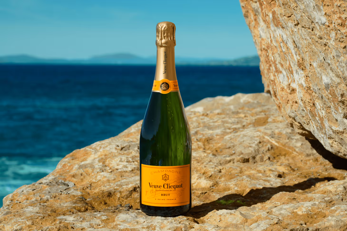
source: [A target='_blank' link='https://www.instagram.com/p/DI6VyLbCoXm/?img_index=1']Veuve Clicquot[/A]
Purple
Purple is the colour of complexity. It’s rich in cultural symbolism and layered with meaning. Historically associated with royalty, luxury, and spirituality, purple still carries an aura of exclusivity and depth. Light lavenders suggest calm and femininity, while deep violets signal heritage and opulence. Used well, purple can lend a sense of mystique and authority (a powerful combination for brands seeking to be both premium and poetic).
To make purple work in your brand system, be mindful of its tone and pairing. Pale purples work beautifully in minimalist or feminine brand worlds, while saturated purples lend gravitas in high-end or disruptive contexts. Combine it with metallics for a luxurious feel, or pair it with neutrals like warm greys or taupes to ground its intensity.
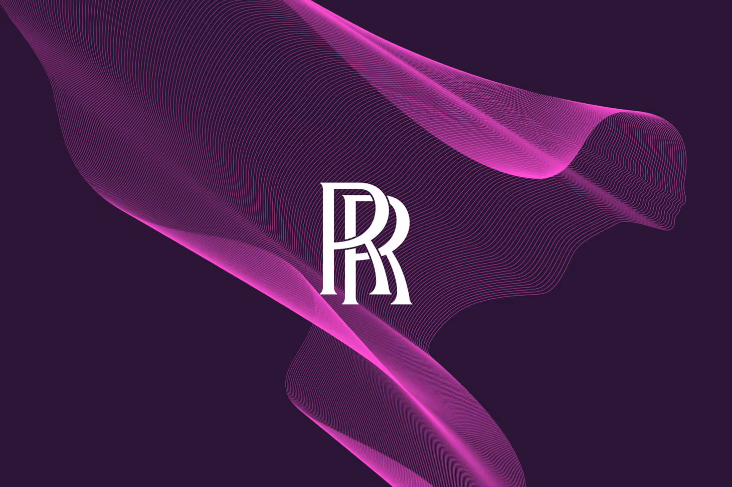
source: [A target='_blank' link='https://www.pentagram.com/work/rolls-royce-3']Pentagram[/A]
Gold
Gold is less a colour and more a statement. It signals prestige, exclusivity and achievement. In branding, it’s often reserved for accents – used to highlight, not dominate. Gold embossing, metallic finishes and subtle shimmer suggest craftsmanship, legacy and status. But gold needs to be used judiciously. Too much, and it veers into pastiche. Just enough, and it becomes a mark of distinction. For premium brands (particularly in fashion, beauty, hospitality and finance) gold is a shorthand for excellence.
Gold works best as a highlight in [A target='_blank' link='https://dd.agency/insights/how-to-choose-the-right-brand-font']typography[/A], [A target='_blank' link='https://dd.agency/branding/assets/packaging-retail']packaging[/A], or [A target='_blank' link='https://dd.agency/branding/digital']UI details[/A]. Consider foil stamping or metallic inks in print, or digital treatments with gradients and texture to preserve its richness. Pair it with deep hues like black, navy, or burgundy for a timeless palette, or soft neutrals for a modern-luxury effect. Think of it less as a colour and more as a signature flourish.
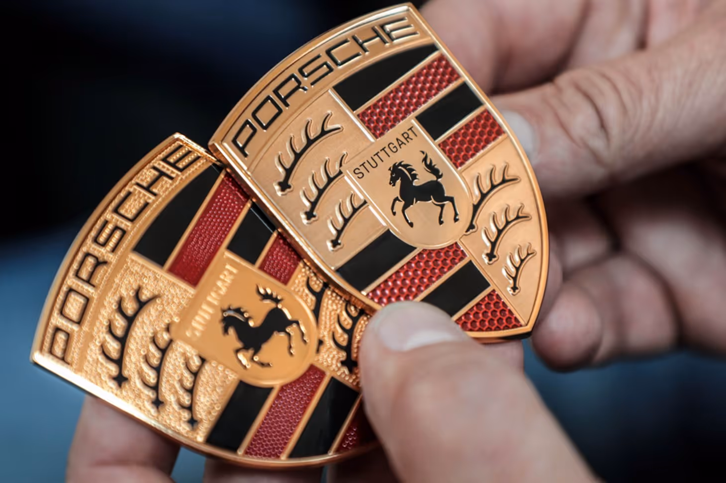
source: source: [A target='_blank' link='https://www.porsche.com/international/']Porsche[/A]
Brown
Brown is grounded, tactile and quietly powerful. It’s the colour of soil, leather, wood – elements that evoke stability, warmth and authenticity. In branding, brown is often used by artisanal, organic or heritage brands that want to convey craftsmanship, sustainability and earthiness. Lighter browns can feel inviting and wholesome, while dark chocolate tones suggest richness and depth. Though less common in digital-first brands, brown can be a strategic differentiator when authenticity, tradition or materiality are core to the brand story.
To incorporate brown into your palette, think in textures as well as tones. It pairs naturally with creams, olives and other earth tones to create a warm, cohesive system. For brands that want to communicate honesty and origin, brown can act as a grounding primary or a supportive secondary. In digital spaces, combine it with [A target='_blank' link='https://dd.agency/insights/how-to-choose-the-right-brand-font']modern typography[/A] and minimal layouts to avoid feeling dated.
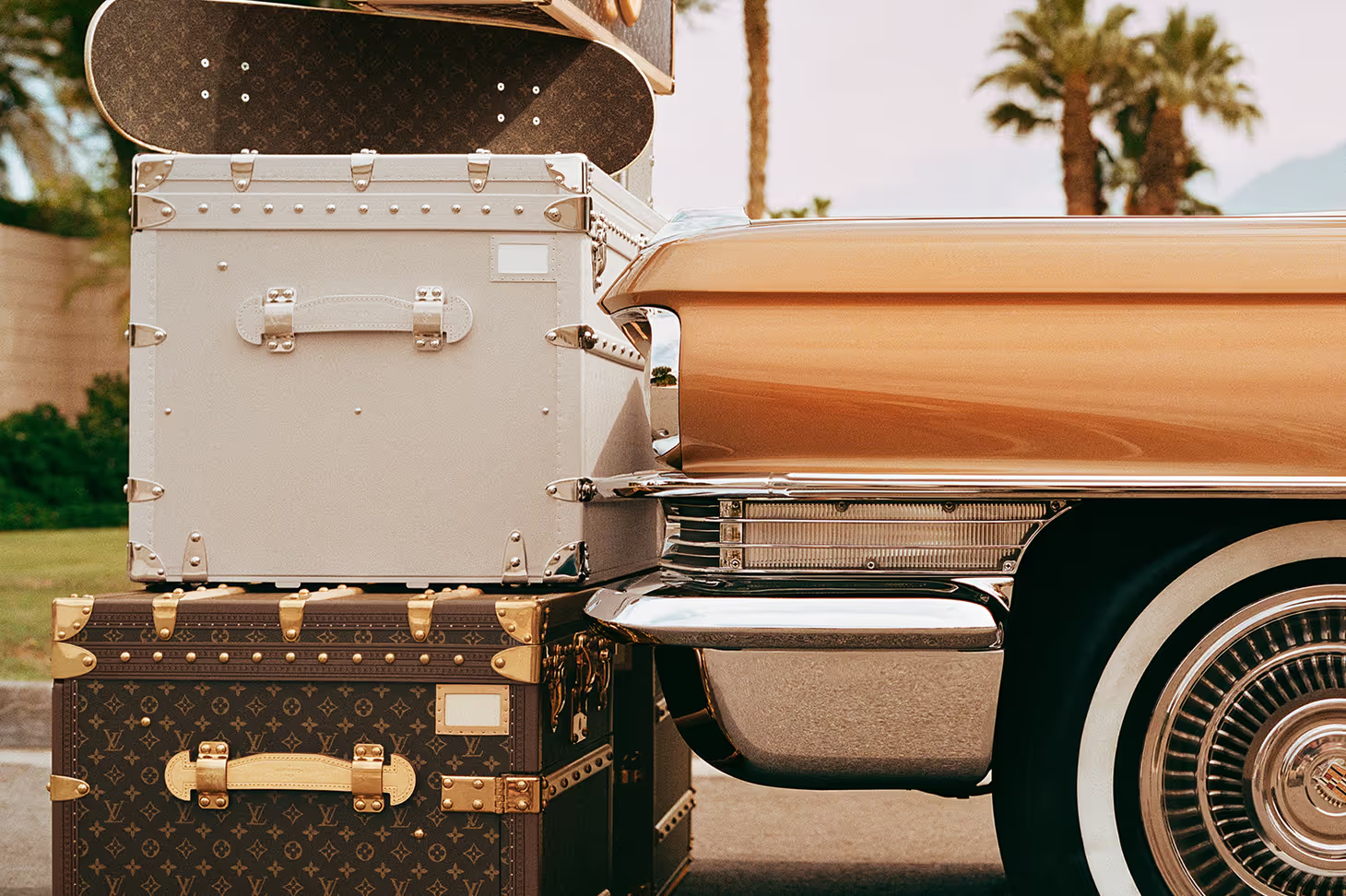
source: [A target='_blank' link='https://en.louisvuitton.com/eng-nl/homepage?dispatchCountry=NL&utm_source=google&utm_medium=cpc&utm_campaign=LV_FLG_NLD_ALWON_MIXT_OTHER_OnGoing_EC_BREX_GTAD_MUL_NL_EUR_EXTM_&gad_source=1&gad_campaignid=1459062401&gbraid=0AAAAADA6F__oWw9cLPklDmiV0GPftwR9A&gclid=CjwKCAjwg7PDBhBxEiwAf1CVu6rFrUhdY84LgPiWinZYSn9RGrMDeVRBMziS2E6X1_0UeB_71EzYAxoCnfQQAvD_BwE']Louis Vuitton[/A]
STEP 2: Learn how application shapes perception
Curating your brand palette goes beyond just choosing colours. It also means deciding the applications that ultimately shape how the colours will be perceived. Saturation, contrast, and application are critical (yet often underestimated) elements that influence not just how a colour looks, but how it feels, performs, and communicates across different contexts.
Saturation
Saturation refers to how intense or muted a colour appears. Highly saturated colours are vivid and bold – think electric blue or neon pink – and often feel energetic, playful or disruptive. Desaturated colours, like dusty rose or sage green, appear softer and more subtle, often linked to calm, elegance or minimalism.
Choosing the right level of saturation helps shape the emotional tone of your brand. Vivid colours demand attention; muted ones invite trust and reflection. Neither is better – but the choice should mirror how you want your audience to feel.
Contrast
Contrast is the difference between two colours when placed side by side. It affects how clearly something stands out – which is why it plays a key role in visual hierarchy, legibility and accessibility.
High contrast (like black on white or red on navy) creates clarity and impact. Low contrast (like beige on blush) feels more subtle and refined, but can be harder to read if not used carefully.
Application
Application is about how and where your colours are used. It considers balance, placement and scale across every element of your brand, from digital interfaces to packaging and print.
A vibrant colour used sparingly might highlight a button or product feature. The same colour used as a background could feel overwhelming. Application gives structure to your palette and ensures colours perform with purpose (not just style).
source: [A target='_blank' link='https://www.valentino.com/en-nl/experience/valentino-pink-ppills-one-stud-xl-sneakers']Valentino][/A]
STEP 3: Know the basics of colour terminology
When building a strategic brand colour palette, it helps to speak the language of a designer. Here’s a quick breakdown of the essential colour terminology you should know:
Hue
Hue refers to the pure base colour found on the traditional colour wheel (i.e. red, yellow, blue, green, and so on). In branding, the hue you choose lays the emotional foundation for your entire visual identity. It’s the starting point before any tint, tone or shade is applied.
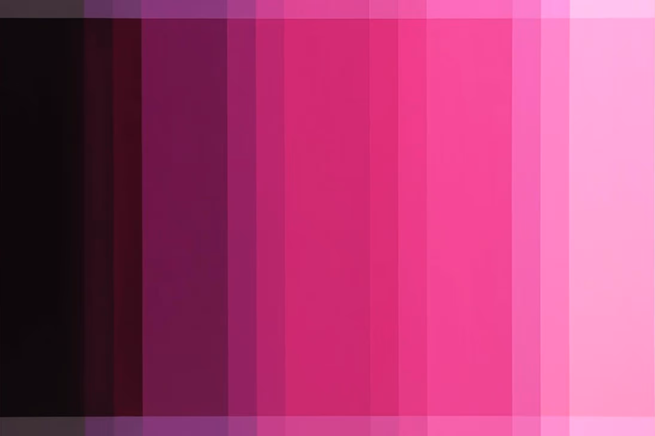
Shade
Shade is what you get when black is added to a hue – resulting in a deeper, darker version of the original colour. Shades tend to carry weight and intensity. In branding, they’re often used to evoke sophistication, depth or authority.
Tint
Tint is the opposite of shade: it’s a hue mixed with white to create a lighter colour. Tints feel airy, fresh, and soft. In branding they’re used to convey approachability, care, or ease (think pastel pink or mint green).
Tone
Tone is created by adding grey to a hue, resulting in a more muted, balanced version of the original colour. Tones are often used to convey subtlety, complexity and refinement – making them a popular choice for brands that value sophistication without excess.
Value
Value refers to the lightness or darkness of a colour, regardless of whether it’s a tint, tone, or shade. Higher-value colours are lighter, while lower-value colours are darker. Value plays a major role in visual hierarchy and user experience (especially in digital environments) and is critical to ensuring readability, contrast and accessibility.
STEP 4: Decide on a single or multi-colour palette
A successful brand palette isn’t always a rainbow – in some cases, it can be built around a single, defining colour. Brands like Tiffany & Co. (Tiffany Blue), Veuve Clicquot (Yellow), and Glossier (Millennial Pink) have mastered the art of owning one distinctive hue across their identity. Done well, a monochromatic palette can create instant recognition, visual cohesion, and a sense of brand purity that cuts through noise.
But while one-colour branding can be powerful, it also comes with limitations. Relying on a single hue demands precision in tone, application, and context. Without supporting colours, it can lack versatility – particularly across digital interfaces, campaign rollouts, or complex product ranges. It also places more pressure on typography, layout and imagery to carry the emotional and functional weight of the brand. That’s why, even in single-colour-led identities, most brands still develop a broader colour system behind the scenes.
If you’re unsure which approach to take, consider your brand’s unique needs. How varied are your products? Will your brand be showcased across multiple channels and platforms? While a single hue can create clarity, a broader palette can offer the flexibility needed to adapt and differentiate.

source: [A target='_blank' link='https://maap.cc/eu']Maap[/A]
STEP 5: Understand the brand colour hierarchy
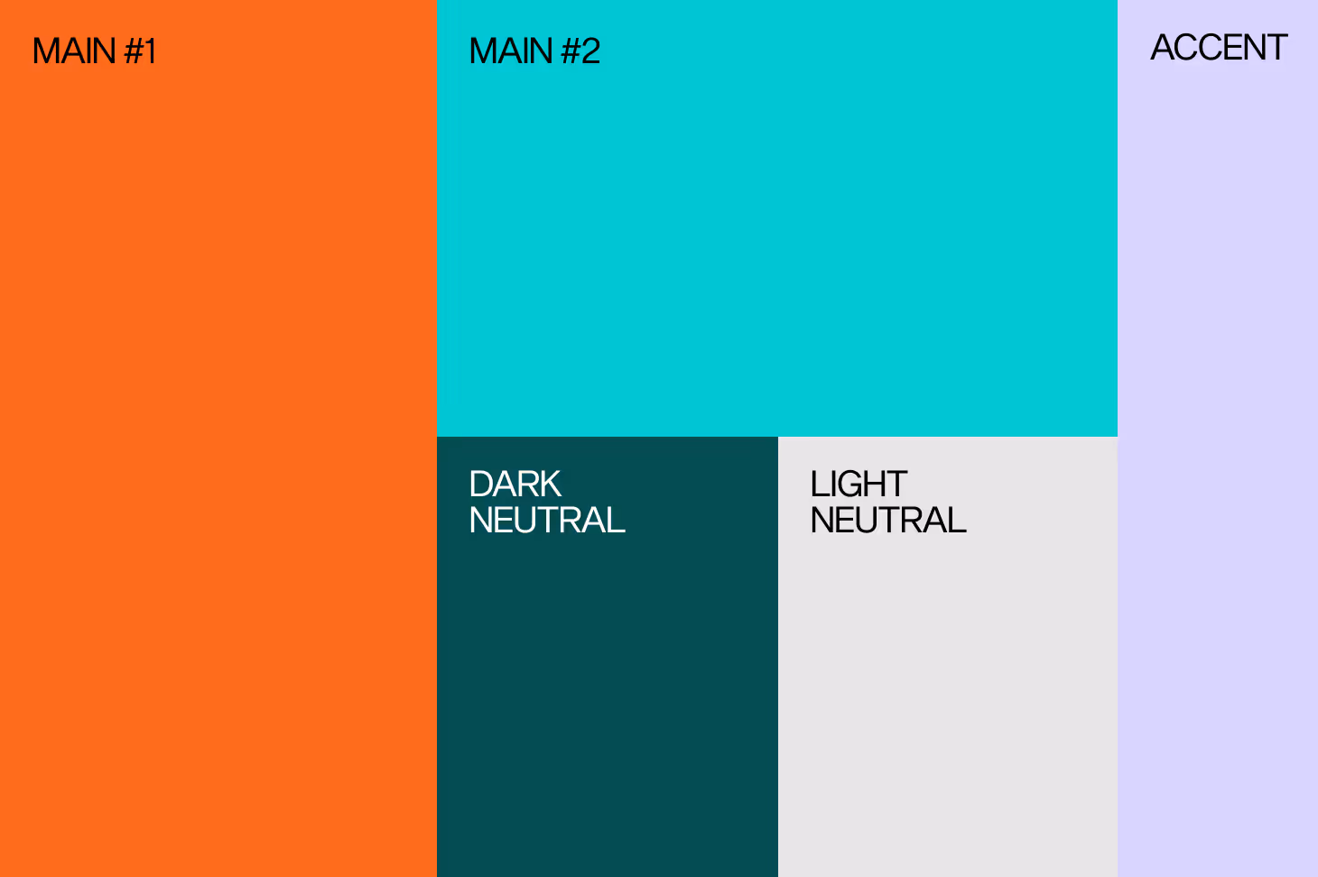
Primary colour
At the heart of your brand colour palette sits your primary colour. This is your signature shade and visual shorthand. It’s the colour most closely associated with your brand, doing the heavy lifting across brand assets.
Secondary colours
Supporting the primary colour are your secondary colours. These tones introduce flexibility and depth, allowing your visual identity to remain dynamic without losing coherence. Whether applied across campaign assets, sub-brands, or product variants, they prevent visual fatigue while expanding the system’s usability.
Accent colours
Accent colours are used sparingly, but intentionally. They act as highlights – adding contrast, focus and rhythm to your palette. Often applied to key messaging, calls to action or navigation, accents guide attention without disrupting the overall aesthetic.
Neutrals
Finally, neutrals provide the structure and negative space your palette needs to breathe. Shades of white, black, grey, and taupe serve as the foundation – supportive yet unobtrusive. Their role is to enhance clarity, ensure readability, and elevate your primary colour by offering balance and contrast.
STEP 6: Select colours that align with your brand identity
Now that we’ve laid the groundwork by deep diving into the psychology, application, terminology and hierarchy of colour, it’s time to build your colour palette.
Whatever colours you choose, it is vital that they act as an extension of your brand identity. After all, your palette is integral to your brand’s visual identity – it tells the story of who you are and what you stand for. It sets the tone before anything else.
So, when curating a meaningful brand colour palette, consider the following:
Who are you [I]really[_I]?
Your brand identity should guide the curation of all branding assets – including your colour palette. Think about your brand story and the message it conveys. How can you translate that into a colour? If you had to reimagine your tagline as a hue, what would it be and why?
What’s the feeling?
Look closely at your audience – and the context surrounding them. Cultural nuance plays a key role. If you’re considering red, for example, remember that it symbolises luck in China, but can suggest passion or danger in Western markets. Age is another important factor. Gen Z may gravitate towards bold, expressive colour, while Millennials often connect with pastels and muted tones that evoke a sense of nostalgia. Colour doesn’t exist in a vacuum – its meaning shifts depending on who’s seeing it, and where.
How will it live?
A strong palette must perform across every brand touchpoint, from [A target='_blank' link='https://dd.agency/branding/assets/packaging-retail']packaging and signage[/A] to [A target='_blank' link='https://dd.agency/branding/digital']digital interfaces[/A] and [A target='_blank' link='https://dd.agency/growth/socials']social[/A]. Will your colours hold up in print? Do they work in motion or under different lighting? Think about flexibility, durability and legibility in every format. Your colours should live well, not just look good.
What’s your signature?
Every memorable brand owns at least one colour – a distinctive shade that becomes part of its identity. It’s not about being loud, but being recognisable. Your signature colour should be used with consistency, becoming a visual cue that reinforces brand recognition across platforms and over time.
Conclusion
Choosing your brand colours isn’t just a creative decision – it’s a strategic one. Every hue carries weight, meaning and emotional resonance. The right palette can clarify your positioning, strengthen recognition and connect with your audience on a deeper level. But building a colour system that’s both distinctive and scalable takes more than taste – it takes intention, insight and experience. At DUTCH DESIGN AGENCY, we help brands move from instinct to impact, turning colour into a powerful tool for growth, differentiation and long-term value.
Ready to build your brand colour palette? [A target='_blank' link='https://dd.agency/contact']Let’s talk[/A].